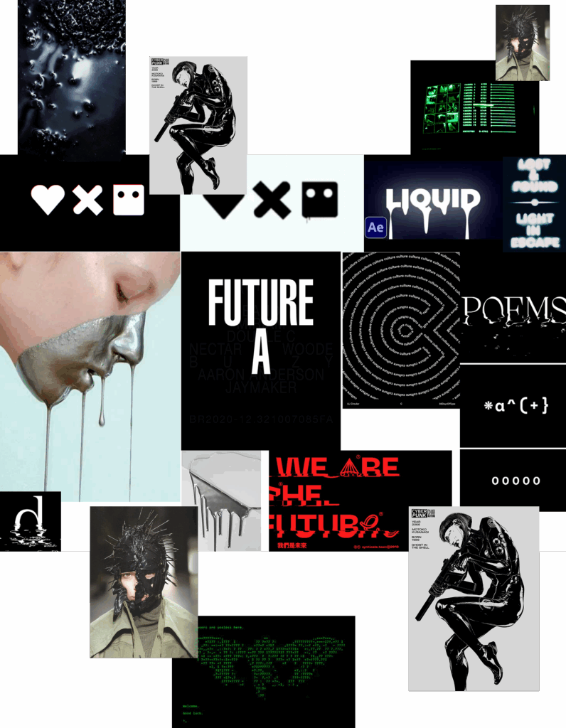
For the fonts, I chose to work with two distinct styles. First one, OCR-X, reminiscent of coding screens, hacking aesthetics, or even spaceship interfaces, sets the mood of the project. The second, Helvetica Neue, was a deliberate choice: not only because the NIFFF is a Swiss festival, but also to create a strong contrast and ensure maximum readability perfect for the bloody effect that needed as much surface as possible.