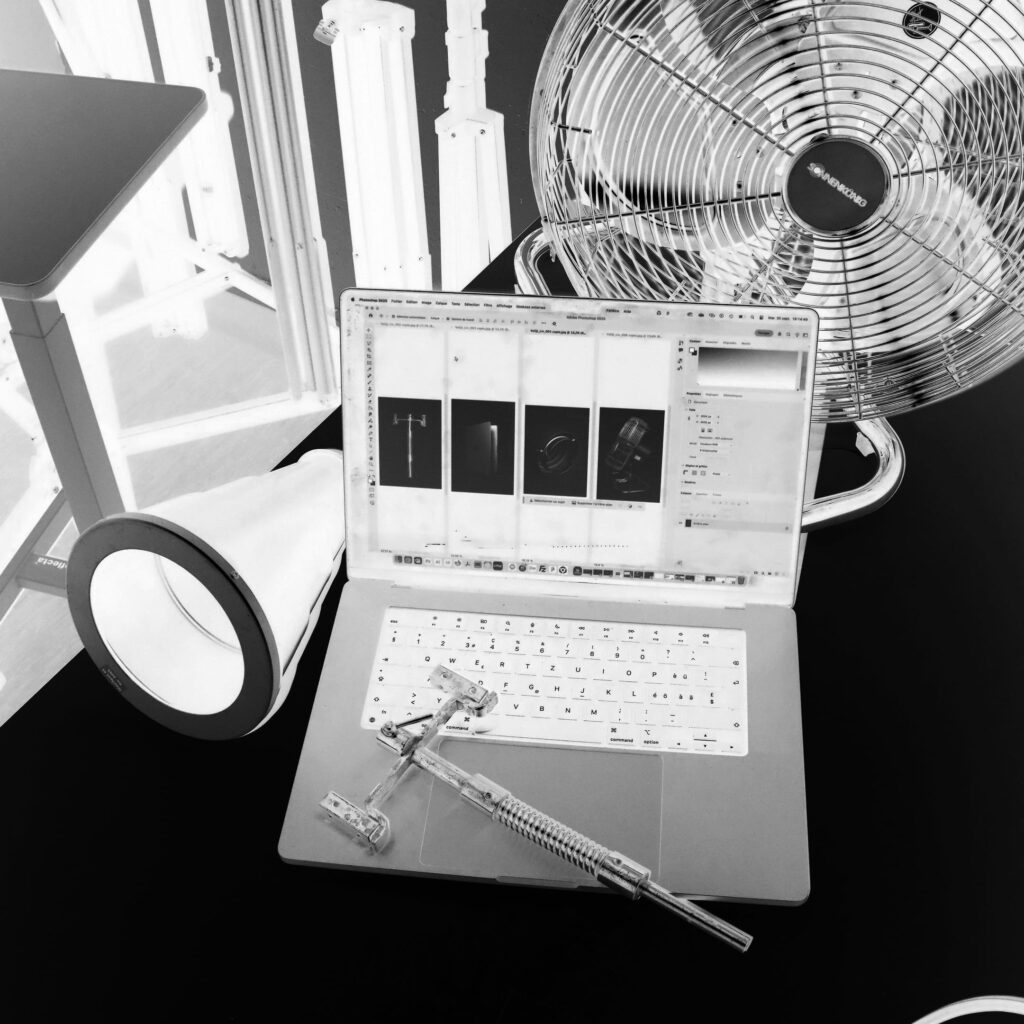
As you can see on the photo, all the objects are significatly differnet (form, size, etc.) but have something in common, they shine bright (like Edward in Twilight). I wanted to put them all at the same size to show their details ans importance, even the smallest one is as important as the biggest one !