(Visual identity & exam)
(Visual identity & exam)
"The ABC Center is unlike any other cinema or theater: it’s an intimate space where poetic films, emerging artists, and human connections intersect at the heart of a vibrant, accessible culture."
The ABC Center is unlike any other cinema or theater: it’s an intimate space where poetic films, emerging artists, and human connections intersect at the heart of a vibrant, accessible culture.
The ABC Center is unlike any other cinema or theater: it’s an intimate space where poetic films, emerging artists, and human connections intersect at the heart of a vibrant, accessible culture.
The ABC Center is unlike any other cinema or theater: it’s an intimate space where poetic films, emerging artists, and human connections intersect at the heart of a vibrant, accessible culture.
WEBDESIGN
For my single-page design, I wanted something structured yet organic, simple and efficient, while respecting ABC’s limited budget. I chose to work entirely in black and white, which also lowers environmental impact. To bring life into the page, film images appear in black and white and switch to color on click. With consistent margins, left-aligned text, and subtle animations, the result is a clean, functional, and identity-driven page that adapts to ABC’s needs.
ID
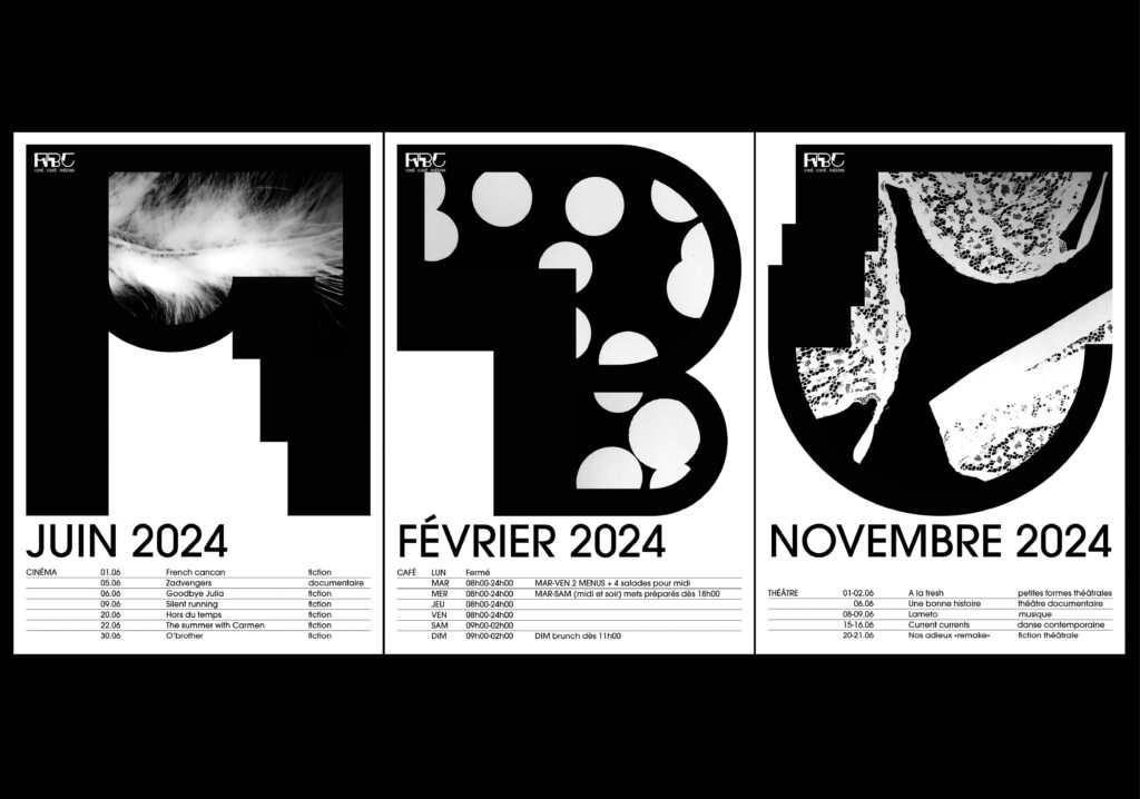
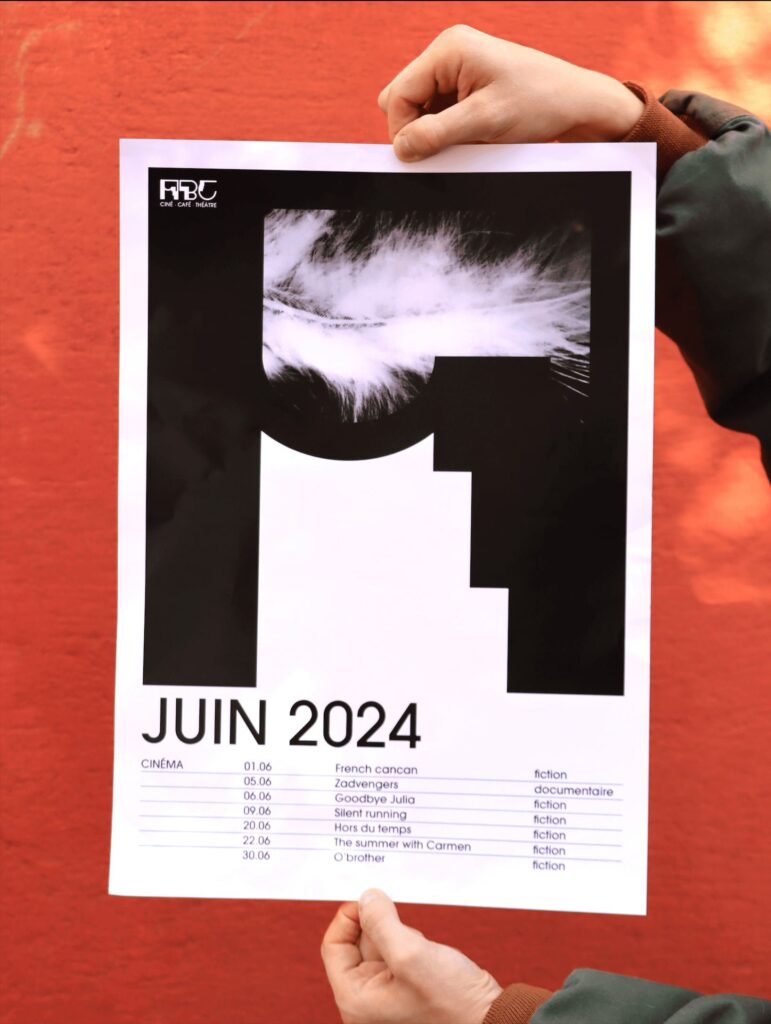
I designed photograms to represent ABC’s monthly themes. They add a poetic yet modern touch, true to the spirit of the place, while remaining easy for the team to reproduce saving money and avoiding external designers.
I also worked in black and white, reducing both printing costs and environmental impact. For typography, I chose the Avant-garde LT, a free font whose geometric and rounded forms echos to my logo. With all that, I was able to creat a coherent, economic, and ecological identity closely tied to ABC’s essence.
ID
I designed photograms to represent ABC’s monthly themes. They add a poetic yet modern touch, true to the spirit of the place, while remaining easy for the team to reproduce saving money and avoiding external designers. I also worked in black and white, reducing both printing costs and environmental impact.
For typography, I chose the Avant-garde LT, a free font whose geometric and rounded forms echos to my logo. With all that, I was able to creat a coherent, economic, and ecological identity closely tied to ABC’s essence.
LOGO
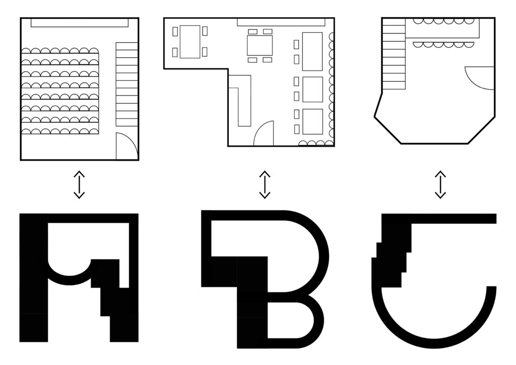
For my logo, I wanted to bring together ABC’s key elements. My first attempt was too rigid: it worked for posters but didn’t reflect the center’s world. I then created a modern, functional, adaptable logo while keeping my initial inspirations: reels, screens, and square tables.
ABC consists of three distinct spaces: the cinema, the restaurant, and the theater. Each of these has a unique shape, which I wanted to reflect in the logo: the A represents the theater, the B the restaurant, and the C the cinema.
ABC consists of three distinct spaces: the cinema, the restaurant, and the theater. Each of these has a unique shape, which I wanted to reflect in the logo: the A represents the theater, the B the restaurant, and the C the cinema.

LOGO
I wanted to bring together ABC’s key elements. My first attempt was too rigid: it worked for posters but didn’t reflect the center’s world. I then created a modern, functional, adaptable logo while keeping my initial inspirations: reels, screens, and square tables.
ABC consists of three distinct spaces: the cinema, the restaurant, and the theater. Each of these has a unique shape, which I wanted to reflect in the logo: the A represents the theater, the B the restaurant, and the C the cinema.
SUMMARY
For my single-page design, I wanted something structured yet organic, simple and efficient, while respecting ABC’s limited budget. I chose to work entirely in black and white, which also lowers environmental impact. To bring life into the page, film images appear in black and white and switch to color on click. With consistent margins, left-aligned text, and subtle animations, the result is a clean, functional, and identity-driven page that adapts to ABC’s needs.


SUMMARY
In the end for this exam, I made a whole visual identity with posters but also a logo and a single page. To develop this visual identity, I relied on Adobe InDesign, Photoshop, Illustrator, Adobe XD, After Effects, Premiere Pro, as well as ABC information, Pinterest, books from the CPNE-AA library, Hoverstaat, and Awwwards.com.

LOGO
I wanted to bring together ABC’s key elements. My first attempt was too rigid: it worked for posters but didn’t reflect the center’s world. I then created a modern, functional, adaptable logo while keeping my initial inspirations: reels, screens, and square tables.
ABC consists of three distinct spaces: the cinema, the restaurant, and the theater. Each of these has a unique shape, which I wanted to reflect in the logo: the A represents the theater, the B the restaurant, and the C the cinema.
